Both Pantone and Dulux have released their colour forecasts, which show that mostly muted earthy shades of beige, browns, and pinks, accompanied by vibrant pops of crimson, blue and green, are going to be overwhelmingly popular in interior trends for the new year.
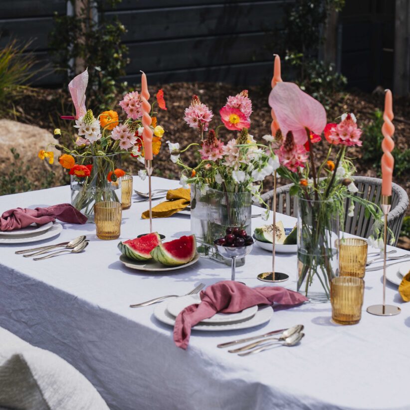
Pantone’s colour of the year for 2023 is a bold and vibrant shade of crimson red, Viva Magenta. An unconventional shade when compared to previous years, Viva Magenta is expressive and strong, drawing on both warm and cool tones, and is inspired by the natural dye of cochineal. Pantone has coupled Viva Magenta with softer shades of blues, pinks, and taupes such as Plein Air, an airy pale blue, and Pale Dogwood, a washed-out peachy pink. While these colours could appear to be on very different palettes, they somehow go together seamlessly, complimenting each other without detracting from the main show that is Viva Magenta.
Meanwhile, Dulux has released three separate colour palettes in their forecast, Balance, Connect, and Revive. Balance is described as “delicate pastels, oceanic hues such as soft greens, and deep moody teals and blues” and when combined, these colours create an elegant and calming aesthetic in the home. The Connect palette heavily features soft, earthly neutrals, focusing on muted greens and browns and bolder shades of charcoal and deep brown, mimicking the natural beauty of the Australian landscape. On the opposite end of the spectrum, the Revive palette brings pops of playful colour in blues, lilacs, pinks, and bold emerald greens. Revive is the fun younger sibling, inspired by the funky colours of the bygone eras of the 70s and 80s. This colour palette is for experimentation and creativity, appealing to those young and young at heart.